This is the True Character of Human Caused Global Warming!
September 20, 2021 Masao InoueTable of Contents
Abstract (Added Nov. 06, 2021)
1. Observed Temperature in the IPCC's 6th Report and Satellite-Based Temperature
2. Discontinuity of Observed Temperature in the 6th Report
3. The Global Warming Hiatus
4. IPCC Got "Human Caused" Global Warming by Rewriting Observed Temperature!
5. Is it Correct to Rewrite to "No Global Warming Hiatus" which is Different from the Satellite-Based Temperature? (Added Oct. 01, 2022)
6. The IPCC Must Cancel the Inappropriate Rewriting of Observed Temperature and Correct the 6th Report (Added Nov. 05, 2021)
Abstract
1. According to the IPCC's 6th Report, the observed temperature has skyrocketed since the 1970s and is consistent with the simulated temperature using human & natural factors, but the satellite-based temperature has different characteristics (Fig. 1ab).
2. The observed temperature in the 6th Report and the satellite-based temperature do not match 2000-2020 when 1979-2000 match, do not match 1979-2000 when 2000-2020 match (Fig. 2ab).
3. The observed temperature in the 5th Report recorded the global warming hiatus, and researchers at that time were studying the global warming hiatus, and there is also the global warming hiatus in the satellite-based temperature (Fig. 3ab).
4. The 6th Report rewrote the observed temperature of the 5th Report and got "human caused" global warming by assuming that there was no global warming hiatus (Fig. 4ab).
5. The 6th Report itself acknowledges that it rewrites as if there is no global warming hiatus using the term "dataset innovations" (Fig. 5ab).
6. If the rewriting of the observed temperature by the 6th Report is canceled, the trends of the IPCC's observed temperature and the satellite-based temperature are almost the same for the entire period when the satellites are available (Fig. 6ab). The IPCC must cancel the inappropriate rewriting of observed temperature and correct the 6th report.
1. Observed Temperature in the IPCC's 6th Report and Satellite-Based Temperature
Figure 1a is Figure SPM.1b of Working Group I contribution to the IPCC's Sixth Assessment Report, black line is the change in observed global surface temperature. The observed temperature (black line) has skyrocketed since the 1970s and is consistent with the simulated temperature using human & natural factors (brown line).
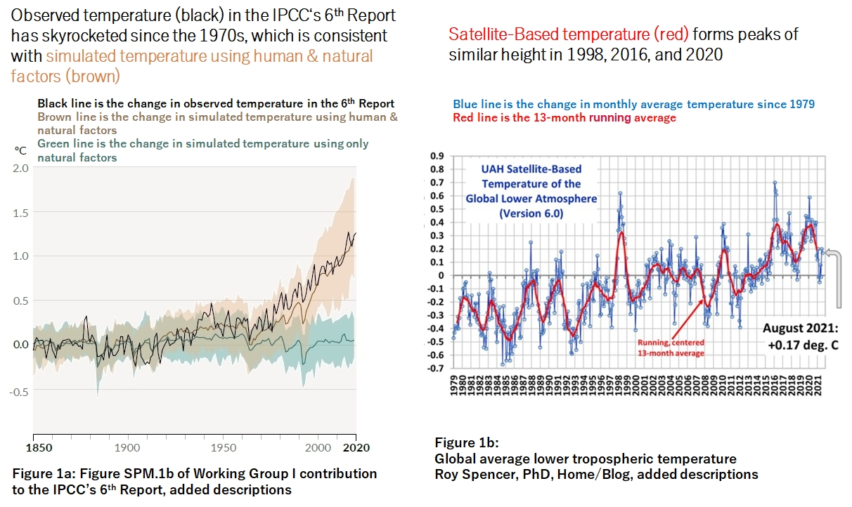
Figure 1b shows the change in Satellite-Based global average lower tropospheric temperature. Blue line is the change in monthly average temperature, and red line is the 13-month running average (Source : Roy Spencer, PhD, Home/Blog)(1). The satellite-based temperature is available since 1979. The satellite-based temperature (red line) forms peaks of similar height in 1998, 2016, and 2020.
The observed temperature of the 6th Report (black line in Fig. 1a) and the satellite-based temperature (red line in Fig. 1b) seems to have quite different characteristics.
2. Discontinuity of Observed Temperature in the 6th Report
Figure 2a is a superimposed figure of the observed temperature (black line) in Figure 1a above and the 13-month running average of satellite-based temperature (red line) in Figure 1b above(2). Looking at Figure 2a, the trends of the observed temperature (black line) in the 6th Report and the satellite-based temperature (red line) are the same in 1979 - 2000(3). However, the observed temperature in the 6th Report (black line) tends to be higher than the satellite-based temperature (red line) in 2000 - 2020.
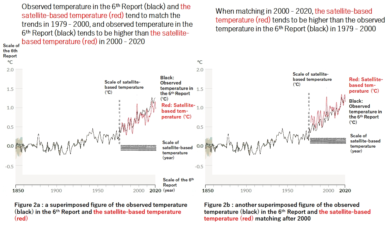
Figure 2b is another superimposed figure of the observed temperature (black line) in the 6th Report and the satellite-based temperature (red line) superimposed so that they match as a whole in 2000 - 2020. In this case, the satellite-based temperature (red line) tends to be higher than the observed temperature in the 6th Report (black line) in 1979-2000.
Figure 2b suggests that if satellite data were available prior to 1978, satellite-based temperature (red line) would tend to be higher than the 6th Report (black) in 1850-2000. In contrast, Figure 2a suggests that if satellite data were available prior to 1978, observed temperature (black line) in the 6th Report and satellite-based temperature (red line) would match in 1850-2000. Therefore, I think it is the correct way to superimpose them so that 1979 - 2000 coincides as a whole, as shown in Figure 2a.
Comparing Fig. 2a and Fig. 2b, I have to wonder if something discontinuous happened around 2000 - 2010 in the observed temperature (black line) in the 6th Report.
3. The Global Warming Hiatus
Figure 3a is the observed surface temperature (3 colors because 3 data sets are overlapped with different colors) in Figure SPM.1 (a) of the IPCC's Working Group I contribution to the IPCC’s Fifth Assessment Report published in 2013. Looking at the figure, temperature rose rapidly from the 1970s, peaked in 1998, and then stopped rising rapidly until 2012. This was called the global warming hiatus (the global warming pause) by climate scientists at that time, and they were investigating the cause. (see Contribution of natural decadal variability to global warming acceleration and hiatus).
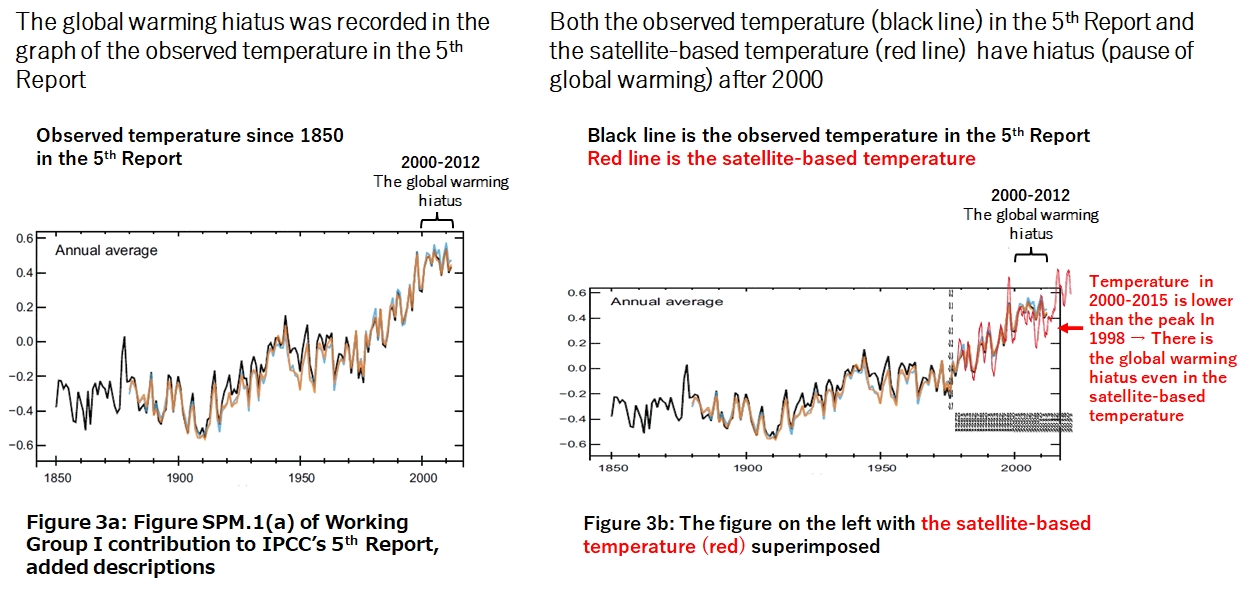
Figure 3b is a superimposed Figure of the observed temperature (3 colors line) in the 5th Report (Fig. 3a) and the 13-month running average of satellite-based temperature (red line) in Figure 1b(4). Looking at Figure 3b, the trends of the observed temperature (3 colors line) in the 5th Report and the satellite-based temperature (red line) are the same in 1979-2000. The observed temperature (3 colors line) in the 5th Report in 2000 - 2012 is in the hiatus. And the satellite-based temperature (red line) in 2000-2015 is also in the hiatus, as it is lower than the peak in 1998.
As mentioned above, the global warming hiatus existed in all of the observed temperature in the 5th Report, the research activities of climate scientists at that time, and the satellite-based temperature.
4. IPCC Got "Human Caused" Global Warming by Rewriting Observed Temperature!
Figure 4a shows the observed temperature in the 6th Report (black line) superimposed with the observed temperature in the 5th Report (Figure 3a) turned red for easy comparison. Looking at Figure 4a, we can see that from 1850 to the 1970s, the observed temperature of the 5th Report and 6th Report were basically the same. From the 1970s to 2000, we can see that the observed temperature in the 6th Report is a rewrite of the observed temperature in the 5th Report to the one with a slightly higher temperature.
For 2000 - 2012, the global warming hiatus was recorded in the 5th Report (red line). But in the 6th Report (black line), the observed temperature was clearly rewritten to the higher one as if there was no global warming global warming hiatus. Looking only at the observed temperature in the 6th Report (black line), we do not notice that there was the hiatus at all. But as mentioned above, It is true that climate scientists at that time were investigating the cause of the global warming hiatus. Since then, the observed temperature (black line) in the 6th Report soared.
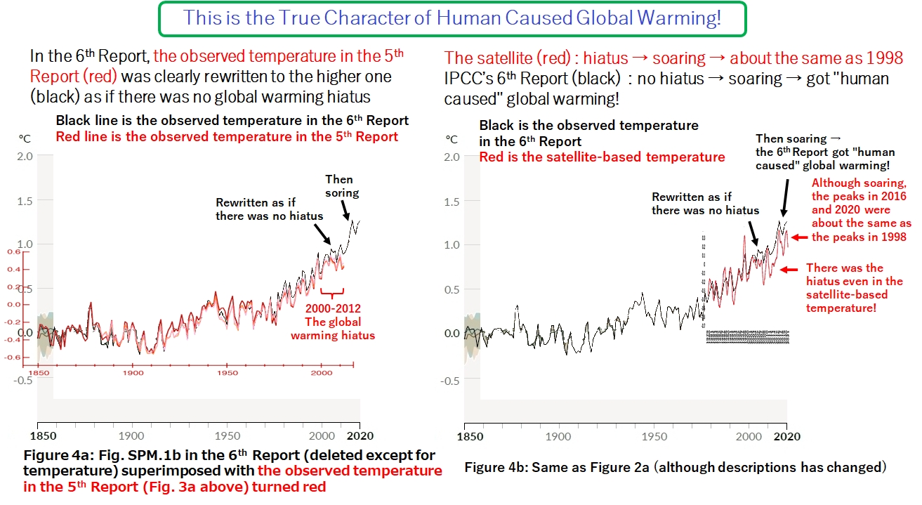
Fig. 4b is the same as Figure 2a above, that is a superimposed Figure of the observed temperature (black line) in Figure 1a and the 13-month running average of satellite-based temperature (red line) in Figure 1b. As mentioned above, the satellite-based temperature (red line) in 2000-2015 was in the global warming hiatus. After that, both the satellite-based temperature (red line) and the observed temperature in the 6th Report (black line) soared to form peaks in 2016 and 2020. The satellite-based temperature (red line) soared from the global warming hiatus, so the peaks in 2016 and 2020 are almost the same height as the peak in 1998. On the other hand, the observed temperature in the 6th Report (black line) soared from a high temperature rewritten as if there was no global warming hiatus, so the IPCC was able to get "human caused" global warming.
The above is the true character of human caused global warming claimed by the IPCC. In other words, the 6th Report rewrote the observed temperature of the 5th Report and got "human caused" global warming by assuming that there was no global warming hiatus. As a result, as shown in Figure 1a, the observed temperature (black line) and the simulated temperature using human & natural factors (brown line) could be matched, so the 6th Report could describe it as "It is unequivocal that human influence has warmed the atmosphere, ocean and land"(see A.1 of Summary for policy makers).
Looking at Figure 4b, the observed temperature from 1850 to the middle of the 20th century (black line) seems to be more naturally connected to the satellite-based temperature (red line), rather than the rapid warming (black line) which the IPCC's 6th Report got by rewriting the observed temperature in the 5th Report. If so, it means that the gradual warming from the beginning of the 20th century is progressing, sometimes with warming pauses in between. In the future, it will be more important to see whether the satellite-based temperature announced at the beginning of each month will actually increase or decrease, rather than the forecasts in the IPCC's 6th Report.
5. Is it Correct to Rewrite to "No Global Warming Hiatus" which is Different from the Satellite-Based Temperature?
Figure 5a is Cross-Chapter Box 2.3 Figure 1 (b) of Working Group I contribution to the IPCC's Sixth Assessment Report (page 612). I showed observed temperatures of the 5th Report and the 6th Report superimposed in Figure 4a above, but the 6th Report itself contained the figure showing the observed temperatures of both the 5th and 6th Reports. However, there are three mistakes in this figure:
(1) The legend on the upper right is incorrect. To be correct, as shown in red in the figure, blue line is AR6 (the 6th Report), and orange line is AR5 (the 5th Report).
(2) "AR5 - AR6" at the bottom right is also wrong, and it is correctly "AR6 - AR5". The scale on the right vertical axis should also be corrected as shown in red.
(3) "1850 - 1900" on the left vertical axis is also incorrect, and "1850 - 2020" may be correct.
Cross-Chapter Box 2.3 with this figure has only 7 pages, but at the beginning there are 28 contributing authors (the 6the Report page 464). It's unbelievable that these 28 contributing authors were unaware of these three mistakes. I think it is dangerous to blindly believe in the 6th Report. Added Oct. 01, 2022: These errors were corrected in the final version (IPCC Sixth Assessment Report, Working Group 1, Chapter 2, Page 322, Cross-chapter Box 2.3, Figure 1).
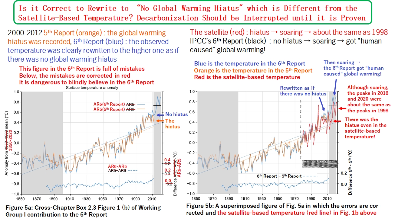
Looking at 2000-2012 in Figure 5a, the global warming hiatus was recorded in the 5th Report (orange line). But in the 6th report (blue line), the observed temperature was clearly rewritten to the higher one as if there was no global warming hiatus. The blue dashed line at the bottom of the figure is the difference between the observed temperature values in the 6th and 5th Reports, and the temperature is rewritten to the higher one by 0.1°C in 2012. In other words, it is a graph that the 6th Report itself acknowledged that it was rewritten so much. However, the 6th Report does not use the term "rewriting observed temperature", but rather the term "dataset innovations" (the 6the Report page 465).
Fig. 5b is a superimposed figure of the observed temperatures in Figure 5a in which the error is corrected and the 13-month running average of the satellite-based temperature (red line) in Figure 1b above. The colors of the lines are different, but what I said about Figure 4b holds true as shown in Figure 5b. As mentioned above, the satellite-based temperature (red line) in 2000-2015 was in the global warming hiatus. After that, both the satellite-based temperature (red line) and the observed temperature in the 6th Report (blue line) soared. The satellite-based temperature (red line) soared from the global warming hiatus, so the peaks in 2016 and 2020 are almost the same height as the peak in 1998. On the other hand, the observed temperature in the 6th Report (blue line) soared from a high temperature rewritten as if there was no global warming hiatus, so the IPCC's 6th Report was able to get "human caused" global warming.
Each country is promoting a decarbonization policy. The basis is the IPCC's 6th Report. It rewrote the observed temperature in the 5th Report to get "human caused" global warming, assuming that there was no global warming hiatus. Moreover, this is different from the satellite-based temperature. Is it okay to believe this as it is and push forward with a decarbonization policy?
Decarbonization entails a heavy burden on the people. What is called green economic growth is subsidized economic growth, and even if some people are enriched, many people must suffer a huge burden. Policy makers in each country should show the IPCC this article (Japanese version) and ask if the rewrite to "no global warming hiatus", which is different from the satellite-based temperature, is correct. And decarbonization should be interrupted until it is proven.
6. The IPCC Must Cancel the Inappropriate Rewriting of Observed Temperature and Correct the 6th Report
Figure 6a is a graph connecting -2012 of the 5th Report (orange line) and 2013-2020 of the 6th Report (blue line) in Figure 5a above (Cross-Chapter Box 2.3 Figure 1 (b)). In Figure 5a above, the observed temperature in the 6th Report (blue line) is rewritten to the higher one as if there was no global warming hiatus. On the other hand, in Figure 6a the rewriting of the observed temperature by the 6th Report is canceled and the figure shows a graph connecting the observed temperature up to 2012 (orange line) with the global warming hiatus and the observed temperature in 2013-2020 (blue line).
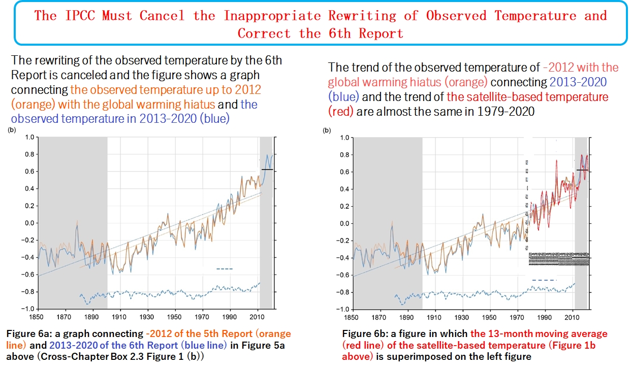
Figure 6b is a figure in which the 13-month moving average (red line) of the satellite-based temperature (Figure 1b above) is superimposed on Figure 6a. The trend of the observed temperature of -2012 with the global warming hiatus (orange line) connecting 2013-2020 (blue line) and the trend of the satellite-based temperature (red line) are almost the same in 1979-2020.
As aforementioned, the observed temperature (black line) in the 6th Report and the satellite-based temperature (red line) do not match 2000-2020 when 1979-2000 match (Figure 2a), do not match 1979-2000 when 2000-2020 match (Figure 2b). And as shown in Figure 3a, the observed temperature in the 5th Report recorded the global warming hiatus, and researchers at that time were studying the global warming hiatus, and as shown in Figure 3b, there is also the global warming hiatus in the satellite-based temperature.
But as shown in Figure 4a, the observed temperature in the 6th Report is rewritten as if there is no global warming hiatus. As shown in Figure 5a, the 6th Report itself acknowledges that it rewrites as if there is no global warming hiatus using the term "dataset innovations".
However, as shown in Figure 6a, if the rewriting of the observed temperature by the 6th Report is canceled, the trends of the IPCC's observed temperature (orange & blue line) and the satellite-based temperature (red line) are almost the same for the entire period when the satellites are available.
It must be said that the rewriting of the observed temperature as if there is no global warming hiatus by the 6th Report is an inappropriate rewriting of the observed temperature.
As mentioned above, the 6th Report rewrites the observed temperature of the 5th Report to the higher one by 0.1°C in 2012, so if this is canceled, the observed temperature in 2013-2020 will drop by 0.1°C. And since the best estimated temperature increase above pre-industrial levels is 1.09°C in the 6th Report (SPM A.1.2), if the inappropriate rewriting of observed temperature is canceled, the temperature increase above pre-industrial levels will be 0.99°C.
Scientists who provide the observed temperature to the IPCC must admit that it is not dataset innovations but the inappropriate rewriting of the observed temperature, and must correct the observed temperature. And scientists who provide the simulated temperature to the IPCC should redo the simulation to match the corrected observed temperature. And the authors of the IPCC's 6th Report must revise the Working Group I contribution released on August 9, this year, and republish it.
(1) Fig. 1a shows the change in surface temperature, and Fig. 1b shows the change in lower tropospheric temperature, but they are comparable. In the troposphere, the temperature drops by about 6.5°C for every 1 km of altitude (see Yoshimitsu Ogura, "General Meteorology, 2nd Edition," p. 21). For example, if the surface of the earth is 20°C, it will be 13.5°C at an altitude of 1km and 7°C at an altitude of 2km. When the surface of the earth changes to 21°C, it changes to 14.5°C at an altitude of 1km and to 8°C at an altitude of 2km. The temperature change is "21°C - 20°C = 1.0°C" on the ground surface, "14.5°C - 13.5°C = 1.0°C" at an altitude of 1km, and "8°C - 7°C = 1.0°C" at an altitude of 2km. In other words, the change in surface temperature and the change in temperature at altitudes of 1km, 2km, ... (the change in lower tropospheric temperature) are the same. Therefore, they are comparable.
(2) In Figures 2a, unnecessary items in Figures 1a and 1b have been deleted. The figures were superimposed as follows. Use JTrim (free software, other software may be used if it has a function to make figures transparent) to paint the part you want to delete in white and make the white part transparent. If you make the figure SPM.1a transparent, it will be difficult to see the scale, so superimpose it on the PowerPoint with the transparent figure other than the vertical axis and the horizontal axis and the scales, and then group them. Similarly, make the satellite figure (Figure 1b) transparent. Paste the transparent satellite figure on PowerPoint, unclick "Fix aspect ratio" in "Position and size", change "Height magnification" and "Width magnification" respectively to align the scale spacing on the vertical and horizontal axes of the transparent satellite figure with that of transparent Figure 1a. As for the vertical axis (temperature), the reference temperature differs depending on the figure, so the values of the scale on the vertical axis cannot be matched. Therefore, after matching the horizontal axis (year), move the figure up and down with the cursor keys so that the two curves match as a whole. However, as shown in Figures 2a and 2b, the trends could be matched for 1979 - 2000 and 2000 - 2020, respectively, but not for 1979-2020. Anyone can reproduce the superimposed figures by the above method.
(3) Regarding the point that the amplitude of temperature change is larger in satellite-based temperature (red line) than in the 6th Report (black line). For example, looking at the 1998 peak in Figure 1b, the monthly average temperature peak (blue line) is April 1998. The peak of the 13-month running average (red line) is the average value of the monthly average temperature (blue line) from October 1997 to October 1998. As a result, the 13-month running average (red line) is an average that captures all the high parts of the mountain centered on the peak. On the other hand, since the 6th Report shows the annual average temperature, it is the average value from January to December 1998. As a result, the average value does not include the October - December 1997 portion of the mountain that peaked in April 1998 but includes the November - December 1998 portion after descending from the mountain. I think this is the reason why the satellite-based temperature (red line) has a larger amplitude of change than that in the 6th Report (black line).
(4) Since the scale of the graph of the 5th Report is aligned with the scale of the vertical axis and horizontal axis of the satellite graph (red line) in Figure 3b, the graph of Figure 3a is compressed in the vertical direction.